Trading Candlestick Patterns | Maven Trading
Written by Hunter on December 15, 2023.You’ve probably heard about candlestick patterns in day trading. What actually is a “candlestick”, though, and how do you read these chart patterns?
We know the terminology can be confusing, so we’re breaking it down below. We’ll also run over nine common patterns to look out for when you’re reading these charts.
What Is a Candlestick Pattern?
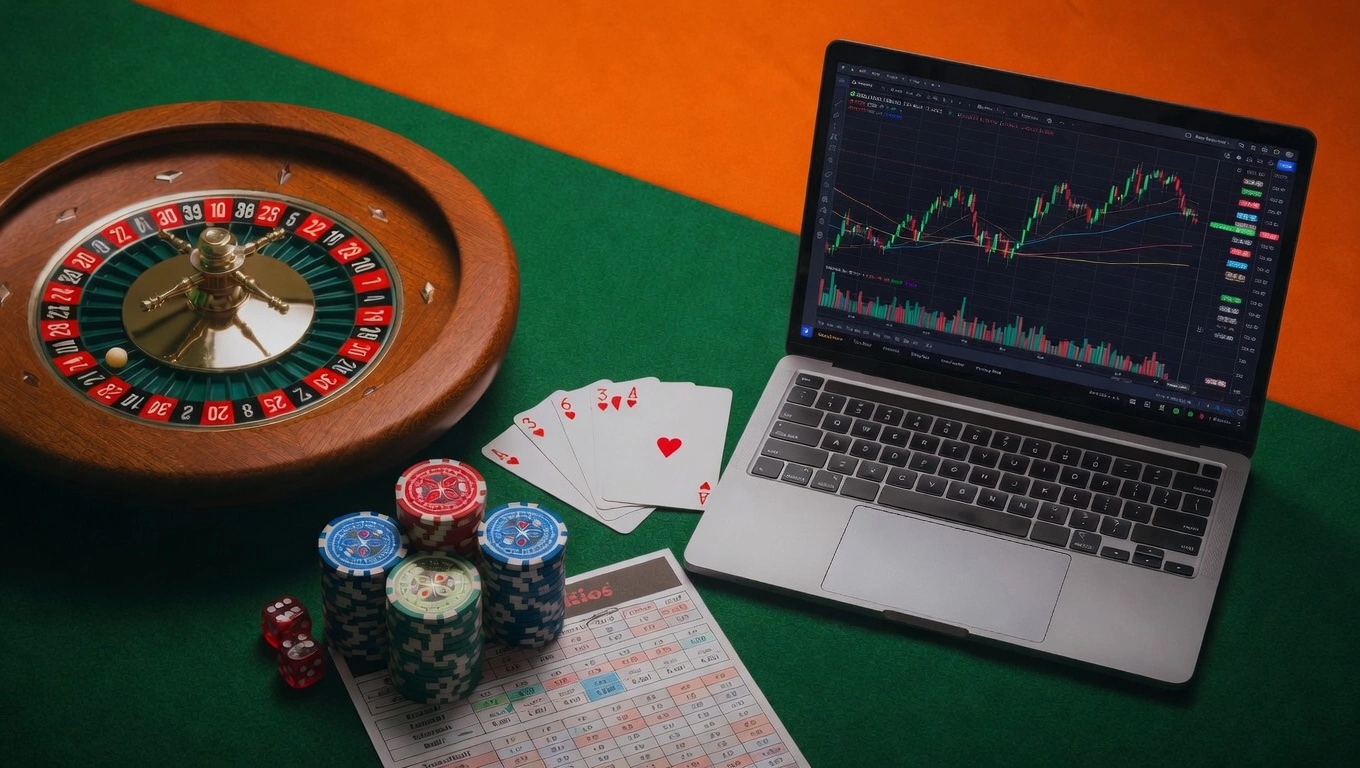
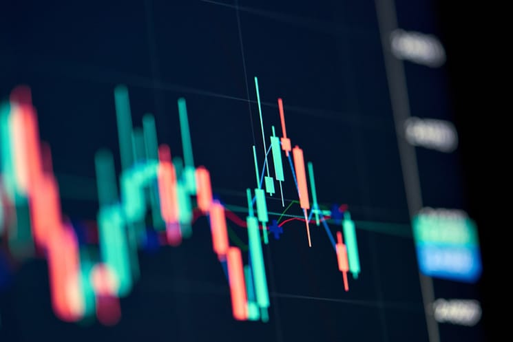
A candlestick chart is a type of trading pattern. It allows traders to visualize price movements, or price shifts, in a specified trading period e.g. a trading day.
Candlestick charts are fairly simple to read and they’re visually appealing, so they’re popular with traders.
How Do I Read Candlestick Trading Patterns?
Every “candle” reveals key price points:
- An asset’s highest price point during the trading period.
- The asset’s lowest price point within that trading period.
- The opening and closing prices.
To read the candlestick, you need to look at its three basic components: color, body, and wick.
- Color: The color reveals the price direction. Green or white candles mean prices are increasing, while black or red means prices are falling. So, for example, you’ll see a green candle if the close price is higher than the open price.
- Body: The body indicates the intensity of price movement. So, the longer the body, the more buying and selling took place. A short body means consolidation.
- Wick: Also known as the shadow, the wick reveals the highest and lowest price points within a timeframe. The top wick shows the highest price, whereas the bottom wick shows the lowest price.
Bulls and Bears
Candle patterns reveal market conditions i.e. whether it’s a “bullish” or “bearish” market. For clarity, bullish means you’ll see price increases as it’s a confident market. Bearish means caution – there’s a decline, and more people want to sell than buy.
Bear these differences in mind when you’re reading chart patterns. For day traders, even short-term fluctuations between bullish and bearish conditions can be critical.
Day Trading and Candlestick Patterns
If you’re day trading, candlestick chart patterns can be helpful. Here’s why.
- Candlestick patterns focus on price points – which are critical for successful day trading.
- When you know how to read candlestick charts, you can spot those all-important price swings. Depending on your trading strategy, you can decide how to respond.
- Candlestick charts help you identify short-term fluctuations and trends in close prices. This is helpful for day traders who typically want to sell by the close of the market.
Put simply, candlestick charts offer clarity and insight for day traders. You can read them quickly – once you get the hang of them – which helps you make fast moves.
Best Candlestick Patterns for Day Trading
All that being said, is there a “best” day trading candlestick pattern? Not really. However, day trading does mean focusing on short-term price swings.
So, you’re looking for signs of market volatility to exploit so you can make the most profit. In other words, you want to find breakout opportunities.
Patterns that can be useful include engulfing patterns and the “spinning top”. We’ll cover these below!
Continuation Candlestick Patterns
A continuation pattern typically means that we won’t say any major shifts in an asset’s price trend right now. The price action is continuing in the same direction. What do such trading candlestick patterns look like? Here are three common patterns.
Three-Method Formations
This pattern means three candles of the same color sandwiched between two candles of the opposite color.
- Three green/white candles: Three greens between two long reds means that bulls tried to reverse a bearish downtrend but failed.
- Three red/black candles: Three reds between two long greens means that buyers tried to control the market. However, they couldn’t reverse an uptrend.
In both cases, despite resistance, the current up or downtrend continues.
Doji
We see a doji when there’s virtually no difference in an asset’s open and close price. It resembles a “plus” sign. Wicks vary in length but the body is always short.
Spinning Top
Spinning tops look like dojis but the wicks are equal rather than different in length. Bodies are short.
They often mean an indecisive market – but one that’s about to experience a shift.
Bullish Candlestick Patterns
Bullish patterns mean there’s confidence in upward price movements. Meaning, prices are likely to rise. Day traders should monitor such patterns carefully to determine when best to make their move. Here are three common patterns to watch out for.
Engulfing
A bullish engulfing means a small red candle at the end of a downtrend. It is dwarfed by a larger green candle. It suggests an uptrend and a move into a buyer’s market.
Hammer
The hammer is a short green candle. It should have a long lower wick (unless it’s inverse, with a long top wick). It forms at the end of a downtrend and shows that bulls, despite pressure, reversed the trend.
Piercing Line
Piercing lines form when there’s a long red candle, then a long green candle, and the green “close” is at least halfway up the red candle body. Usually, piercing lines mean prices are rising (sometimes steeply).
Bearish Price Candlestick Patterns
When we see “bearish” signals, there may be a downtrend on the horizon. For day traders, this could mean it’s time to be a little cautious. Here are three common bearish patterns to look out for.
Engulfing
Here, you’ll see a small green candle at the end of an uptrend. The following larger red candle overpowers or engulfs it. It means prices have peaked and we’re heading for a downturn. The lower the following red candles, the sharper the fall.
Hanging Man
The hanging man looks like the hammer upside-down (short body with a long wick). Although this time, it’s a red candle at the end of an uptrend. It means that buyers are pushing prices up again, signaling a downtrend.
Dark Cloud Cover
A “dark cloud” forms when prices fall. You will see a red candlestick opening above, or sitting higher than the preceding green candlestick. The red candle will close below the green candle midpoint.
The shorter the wicks, the more aggressive – and certain – the downtrend.
Join Maven Trading and Start Your Day Trading Journey
Want to grow your trading skills? Then we want to work with you! At Maven Trading, we help promising traders develop their craft and learn the art of day trading. We give you access to simulated capital, and in exchange, you make trades.
If you’re successful, you keep a percentage of the virtual profits.
You’re not risking your own capital, either, since we provide the simulated funding. Try our challenge accounts, or apply for an instant funding account if you want to start right away. Make your choice now!